Sunday, July 3, 2011

Walter Trier and "The Veiled Menace" Effect:


Once a year, or at least every two years, I re-read two books. One of them is 'Das doppelte Lotchen' (The parent trap) and one of them is 'Erich und die Dedektive' (Erich and the Detectives). They were both written by Erich Kaster, a very well known German (in Germany/and other parts of Europe) children's (and also non children's) author.

The stories by Kastner are fantastic, and I will talk more about them at length some other time, I'm sure, but all of his books were illustrated by Walter Trier, and this is who this entry is about.
There is something really special about Walter Trier's work, because while his illustrations are funny and make the book itself a beautiful object to own, he also has this way of drawing characters that are specific, but yet abstract enough so that the viewer can give them more personality themselves. Trier's characters are made of a strange combination of realism, caricature and blank slate. This is noticable especially in the faces. The most important part for us the viewer to be able to relate to the characters themselves. In his illustrations for the Erich Kaster books I am so fond of, it's very noticable that he employs an extreme economy of line when it comes to the faces. Most characters have mere dots for eyes. Two tiny lines on top for eyebrows, a curved line for a nose and another for a mouth. The bare bones. The minimal. Sometimes characters who are not very important in the image or ones who are in the background are missing faces all together, or have parts of them missing. Yet, it does not look as if they are dismembered strange looking characters... we mere realize that they are not central to the story.
The minimal faces we do see, that Are central to the story, are that much more live like to us, because we the viewer are each completing the face in our minds. We are filling in the gaps so to say. In illustration, images that make us the viewer complete an action are referred to as the 'veiled menace'. In order to fall into this category an illustration will have made your mind fill in the gaps, so that in your mind you see a different action than in the original image.
With Trier's faces something very similar happens, but instead of us completing an action, we are completing a character in our minds. In other words, Trier is not 'ruining' the magic of the story for us by showing us exactly what the characters look like. He is still letting us image them, but giving us a few more visual guidelines along with the text. This is I think what make Trier's at first glance perhaps very simple and rough work so perfect for Kastner's stories.
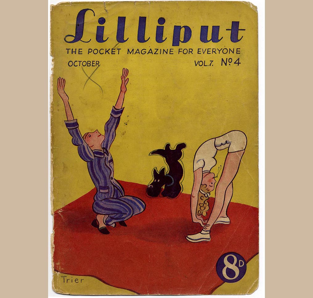
Until recently I knew nothing of Trier's history, and was amazed, but not surprised to find that he was a big fan of toys and puppets. Collecting and making, drawing and including them in his artwork. I also found a really fantastic collection of Covers he did for an anti nazi magazine put out in the 1940's called Lilliput. Check out the link here. Notice that the cover Always includes a guy, a woman and a dog. A fun exercise for an illustrator, no? How many ways could you draw the same concept over and over again?

Friday, June 10, 2011

The Illustrators of Charles Dickens


While trying to find more about the printing techniques used for early 19th century illustrated books such as Charles Dickens and thus the work of all illustrators who have worked in tandem with his creations, I came across this very interesting site which features a bit of history around each of the long line of these illustrators and their lives.
It makes it very clear that back then writer and illustrator had a very close working relationship which would thus produce great work, unlike the often unfortunate separation of writer and illustrator in today's publishing world.

Of note: Hablot Knight Browne adopted the moniker 'Phiz' that he is so well known for to complement Dicken's 'Boz' and was only hired once Robert Seymour (Dickens former illustrator) committed suicide. Once working together Phiz and Boz developed a great relationship, working together for 23 (!) year, until Phiz illustrated Dickens 'A Tale of Two Cities' which was a more serious story and did not complement his artwork, nor did his artwork complement the story. After this they never worked together again!

Also of note: George Cruikshank, another famous Dickens Illustrator apparently claimed that the plot and many of the characters from Oliver Twist were his idea after Dickens died. Very interesting. Of course this was strongly denied by Dickens friends, but why would this not be true? It is only natural that when two people work together on a project ideas are bound to be exchanged freely and so George Cruikshanks drawings for characters in particularly would have influenced Dickens greatly. It would be interesting to know what their collaborative process was. In other words, did they meet prior to Dickens having finished the story already. Did they bounce ideas off another. How often did Cruikshank usually have to change/alter his illustrations to satisfy Dickens etc...

Thursday, June 2, 2011

Andre da Loba


I'm pretty sure I don't have to write a lot for this because the images themselves are going to say it all. Apparentely you have to live in Portugal to have imaginative, unconventional books published. Hurrah for Portugal, ... Booooo for North America.
Check out his totally mind-blowing website www.andredaloba.com

Sunday, May 15, 2011

More on Warja Honegger Lavater


The super helpful and knowledgeable girl who works at MacLeods Books had told me that the artist had made a whole series of well known Children's stories in the same style. She said that the version of 'Little Red Riding Hood' was the most popular amongst them.
Since I wasn't familiar with Warja Honegger Lavater, I did a bit of pocking around online when I came home and found a very good article here on 'And The Ghosts So Silver'. It features more images of the inside of the 'Little Red Riding Hood' book.

Warja Honegger Lavater


So the other day I happened to swing by MacLeod's Books that I had just mentioned in my last post, and amongst finding a great little 'Small Beer' by Ludwig Bemelmans and another fantastic little book, I also found the mother of all versions of 'The Ugly Duckling' by Waria Honegger Lavater. When I saw it in the case I was immediately drawn to it because it promised to be an interesting take on the story right away due to it's abstract cover. I asked to take a look and ... Amazing! The artist has developed a visual, symbolic code for the various characters and scenery in the book. There is a guide at in the front of the book that one can use to help reinterpret the story. Fantastic idea. And to make it even better, the accordion style book can be hung from the wall , thus functioning as both book and wall art simultaneously. Some people are just so clever. ... Of course this copy was about 100$, so alas I did not pick it up, however, should you have the cash on hand to do so, you know where to get it. Might really be worth it.

Here is a picture of the cover I took. So unique.

Tuesday, May 10, 2011

Always buying books...


I always like to do a shout out to any left over independent bookstores we have. The other day we went on a day trip to New Westminster and I finally got a chance to go to Renaissance Books. It's surprisingly big and there's tons of books in there. Mind you, not occupying every square inch like at McLeod's, one of my favs. Some good finds in the kids book and Art section at Renaissance including these here. Plus an empty vending machine which we were trying to convince the owner to turn into a book vending machine. That would be cool yeah?

The Elegant Cockroach, a Picture Book for Adults, Hurrah!


I recently made a visit to Collage Collage, one of my favorite places here in Vancouver and while looking for a Bruno Munari book, discovered that they did not only have the new book 'The Elegant Cockroach' published by Uppercase Magazine in stock, but they also currently have a show of the original illustrations from the book up!

For anyone living in Vancouver who is interested in illustration, I highly recommend you check out this show because it is truly amazing and inspiring. It's great to see illustrations that are exactly the same as in the book, made without the use of photoshop. While I am a firm believer in the powers of photoshop it's refreshing to see work that fits the content of the book so perfectly in all aspects, in this case all assembled via our good old hands. Also, I was also totally won over by the use of photocopied frames for the works. So lovely!

The show is up until June 2nd at Collage Collage, so do go check it out and buy the book too, cause it's a little gem!

About the Book itself:
I am super excited about pretty much any well crafted picture book for adults, and there are not that many...YET.
And so it will come as no surprise to you that since this book is in my opinion beautifully written, masterfully illustrated and of interest for many adults who might perhaps usually not gravitate towards a picture book format I couldn't be happier about it and hope that it will open the floodgates for many other publishers to take more chances and take on similar projects. Adults need picture books too, yes they doooo!

Go see the show.
Go buy the book.